Color Blind Chart Meme

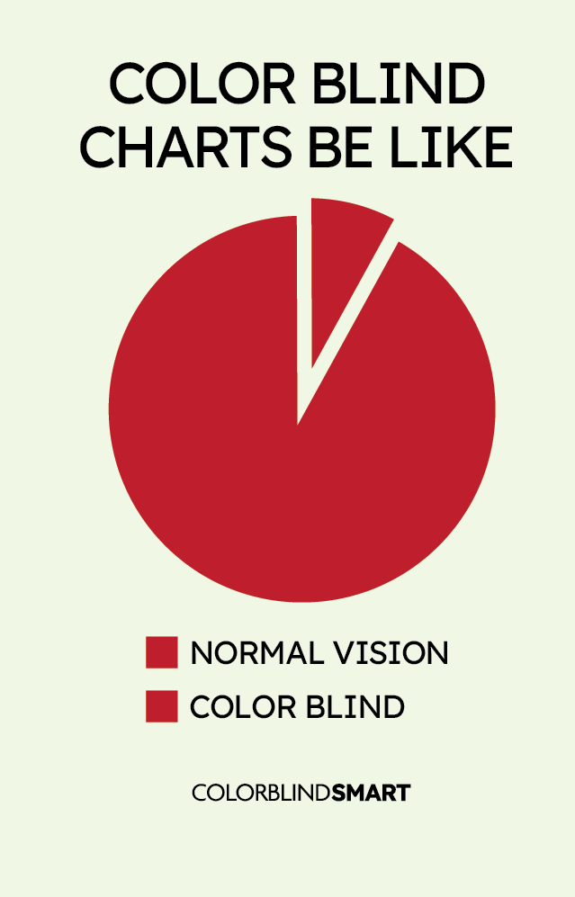
This meme highlights the challenge color blind people face when interpreting charts that rely on similar colors. Learn how color vision deficiency affects data readability and why accessible chart design matters.
This meme features a Rubik’s Cube completed with swapped red and green squares, showing how colorblind individuals might unknowingly declare victory. The humor lies in the fact that the cube looks “solved” to someone with red-green color blindness, even if it doesn’t meet the traditional standard. It’s a relatable example of how small adjustments in perception can turn challenges into personal wins. The meme also encourages empathy by showing how colorblindness affects even recreational activities.
How to Read Charts When You’re Color Blind
Many people with color vision deficiency (CVD) struggle with charts and graphs that rely on color coding. Around 1 in 12 men (8%) and 1 in 200 women (0.5%) have red-green color blindness, making certain colors—like red and green or brown and orange—hard to tell apart. This is a common theme in color blind memes, highlighting the everyday frustration of color-coded information.
Understanding color blind charts and how to adjust them can help make data more accessible. Here’s how to work around color-based challenges when reading or designing charts.
Use High-Contrast or Patterned Charts
Many color blind charts now use high-contrast color combinations and visual patterns instead of relying solely on color. When reading or creating charts, look for:
- Stronger contrast – Blue and orange are easier to distinguish than red and green.
- Patterns and textures – Dotted or striped bars and lines create a clear distinction.
- Direct labeling – Placing numbers or text directly on data points avoids color confusion.
Tools like Color Universal Design (CUD) and ColorBrewer offer color palettes designed for better accessibility.
Adjust Colors Digitally
If a chart uses difficult color combinations, software settings can help.
- Browser extensions – Tools like Colorblindly adjust colors for better visibility.
- Spreadsheet settings – Programs like Excel and Google Sheets allow users to change chart colors.
- System-wide color filters – Windows, macOS, and mobile devices include colorblind modes that shift red-green hues.
Changing colors can make it easier to distinguish sections of a chart.
Convert to Grayscale or Monochrome
Some people with color blindness find grayscale charts easier to read.
- Printing in black and white eliminates color confusion.
- Converting digital charts to grayscale can reveal if differences are still visible.
- Requesting a pattern-based version can provide an alternative to color coding.
Many reports now include monochrome-friendly formats for accessibility.
Identify Colors with Apps
When a chart is heavily color-coded, color identification tools can help.
- Color Blind Pal – Identifies colors in real time.
- Seeing AI (Microsoft) – Reads text and describes colors for accessibility.
- Adobe Color Wheel – Adjusts colors for better contrast.
These tools help clarify color blind charts when adjustments aren’t possible.
For those with color blindness, reading charts is often difficult when colors look too similar. Using high-contrast palettes, patterns, grayscale versions, or digital tools can make information easier to interpret. Since color blind memes often highlight these struggles, more organizations are starting to design color blind-friendly charts for better accessibility.
Last updated: April 04 2025

