Color Blind Bomb Squad Meme

How to Solve a Rubik’s Cube When You’re Color Blind
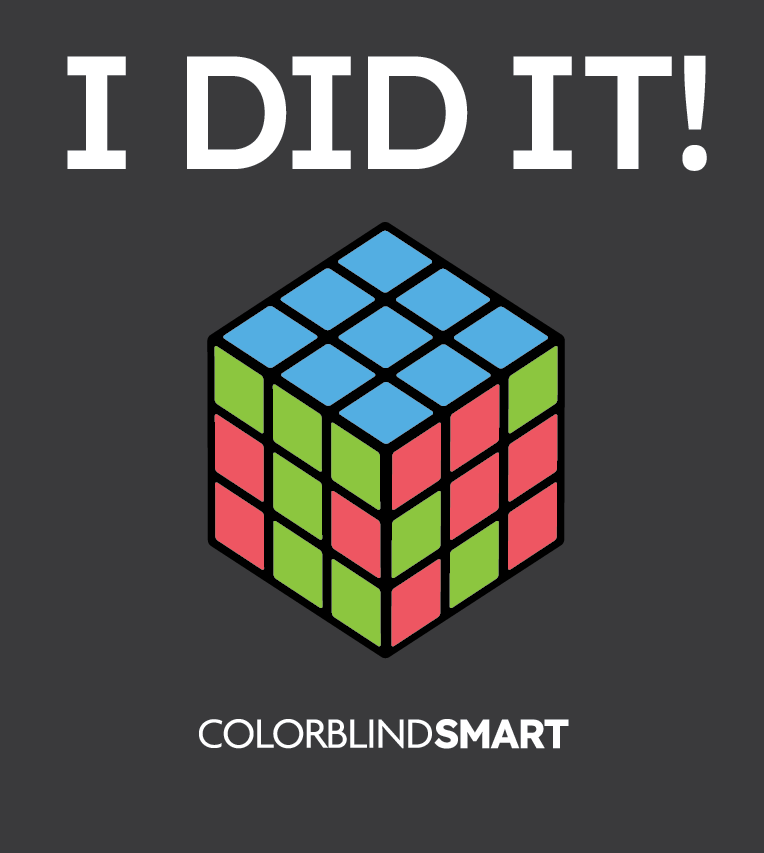
This meme features a Rubik’s Cube completed with swapped red and green squares, showing how colorblind individuals might unknowingly declare victory. The humor lies in the fact that the cube looks “solved” to someone with red-green color blindness, even if it doesn’t meet the traditional standard. It’s a relatable example of how small adjustments in perception can turn challenges into personal wins. The meme also encourages empathy by showing how colorblindness affects even recreational activities.
How to Read Charts When You’re Color Blind
Color-coded charts can be difficult for people with color vision deficiency (CVD). Many rely on reds, greens, and other similar hues to differentiate data, making them hard to interpret for those with red-green color blindness. This is a common theme in color blind memes, often highlighting the frustration of distinguishing between similar colors in graphs and diagrams.
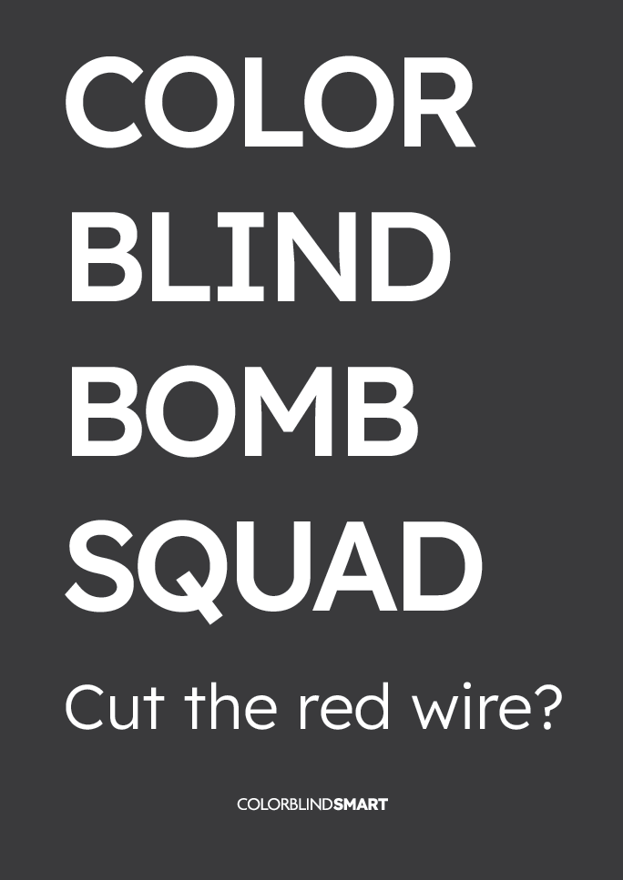
Approximately 1 in 12 men (8%) and 1 in 200 women (0.5%) have some form of color blindness. Many experience challenges with color blind charts, especially in fields where data visualization is essential. While some joke about the struggle, similar to the color blind bomb squad meme, where precise color identification is critical, there are ways to adapt and read charts more effectively.
Use High-Contrast Colors and Patterns
Charts designed with accessibility in mind use contrasting colors and patterns to differentiate data. For those designing or adjusting charts, consider:
- Using blue and orange instead of red and green, as they are easier to distinguish.
- Adding dotted, striped, or cross-hatched patterns in bar graphs or pie charts.
- Labeling data directly rather than relying on a legend that only uses color.
Many visualization tools, such as ColorBrewer and Color Universal Design (CUD), provide colorblind-friendly palettes to improve readability.
Adjust Colors with Digital Tools
If a chart is difficult to interpret, changing the colors digitally can help.
- Browser extensions like Colorblindly can modify webpage colors for better contrast.
- Spreadsheet settings in Google Sheets or Excel allow users to customize chart colors.
- System-wide color filters on Windows, macOS, and mobile devices provide colorblind accessibility options.
Adjusting color settings can make subtle differences more visible.
Convert Charts to Grayscale or Monochrome
Some people with color blindness find grayscale charts easier to read than color-based ones.
- Printing charts in black and white removes color confusion.
- Converting digital charts to grayscale helps determine if colors are distinct enough.
- Requesting high-contrast alternatives ensures better visibility in reports and presentations.
Many scientific and business documents now include monochrome-friendly formats for accessibility.
Use Color Identification Apps
If a chart relies heavily on color coding, digital tools can assist in identifying colors.
- Color Blind Pal detects colors in real time and provides descriptions.
- Seeing AI (Microsoft) describes colors and reads text for accessibility.
- Adobe Color Wheel helps adjust colors for better contrast.
These tools can be useful when chart modifications are not an option.
People with color blindness often face challenges when interpreting color-coded data. Color blind memes and jokes like the color blind bomb squad meme illustrate how difficult precise color recognition can be. By using high-contrast color schemes, digital tools, grayscale alternatives, and pattern-based designs, those with color vision deficiency can better navigate color blind charts and improve data accessibility.
Last updated: June 11 2025


