Color Blind Colors
Quick Answer: The most common colors involved in color blindness are red and green, but the condition can affect a broad range of hues across the entire color wheel.

People with color vision deficiency (CVD) frequently struggle to distinguish more than just red and green, especially when those hues are blended into secondary or tertiary colors.
Some researchers estimate that color blind people perceive far fewer distinct hues—some suggest it might be as little as 10% of what those with typical color vision see. While that statistic may sound discouraging, understanding how color blindness works and developing mental strategies for color perception can transform your experience from limitation to strength. I’m red-green color blind, and this insight gave me the courage and knowledge to sharpen my perception and overcome my color blindness.
Color Blindness and the Color Wheel
Despite living with color blindness, I’ve managed to earn a degree in graphic design. Today, I lead a team of designers who rely on color theory to communicate visually. Initially, this path seemed unattainable, but coming to grips with the fundamentals of color theory was the best preparation I could have asked for. Knowing how hues interact and where they sit on the color wheel helped me adapt my methods for analyzing color.
Visualizing color blindness can be as simple as shrinking the color wheel along certain confusion lines. In red-green deficiencies, the entire portion of the wheel stretching from red to green collapses into a narrow band of color. Shades that appear distinct to someone with typical color vision end up overlapping for someone like me.
For instance, if a green hue leans toward yellow, I’m more likely to interpret it as simply yellow. If an orange hue leans heavily into red, it might read as a dull brown. Similarly, if a purple hue contains enough red, I might perceive it as more of a cool blue than a bright magenta. These shifts are subtle, but they affect daily life in ways that can be surprising—especially when dealing with color codes, organizing objects by color, or working on creative design projects.
Red-Green Color Confusion
A common misconception about color blindness is that it’s like seeing in black and white. Another assumption is that red-green color blindness only affects how a person sees those two hues. In reality, a range of colors can become confused when the retina’s cone cells responsible for detecting red or green wavelengths aren’t functioning properly. The “red” cone cells overlap significantly with the “green” cone cells in all humans, so when either types of cones malfunction, a myriad of related hues become tricky—like orange (which contains red), purple (often a blend of blue and red) and teal (a blend of blue and green).
Types of Red-Green Color Blindness
1. Green-Blind (Deutan)

Deutan deficiencies arise from malfunctioning or absent green cone cells. In deuteranomaly, the green cones respond to wavelengths that are closer to red. In deuteranopia, the green cones are absent or very sparse. Both forms cause confusion between shades that contain any degree of green or red. It can affect how one perceives teals, oranges, and purples—basically, colors that lie on the red-green confusion lines.
2. Red-Blind (Protan)

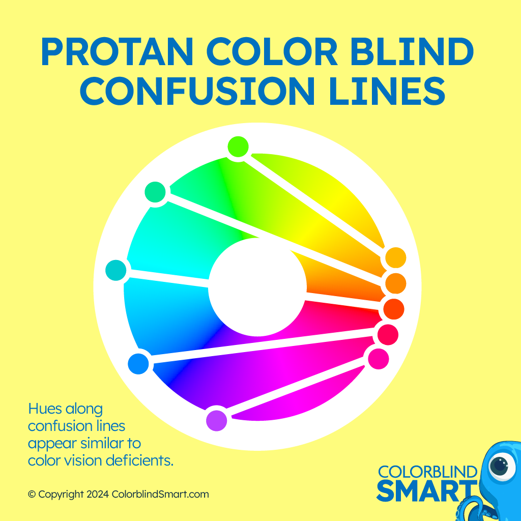
Protan deficiencies involve red cones. Protanomaly means the red cones are present but react to wavelengths too close to green. Protanopia means the red cones are largely absent. Individuals with protan issues see reds as darker and sometimes confusingly merged with greenish tones. The net result is still a red-green color deficiency, but the specific color confusion lines differ slightly compared to deutan types.
Red-green color blindness is by far the most common form. About 8% of men (one in twelve) have a variant of red-green deficiency. Women can have it too, though it’s less prevalent because it’s often inherited on the X chromosome, and women have two X chromosomes (allowing one to compensate if only one carries the colorblind gene).
Blue-Yellow (Tritan)

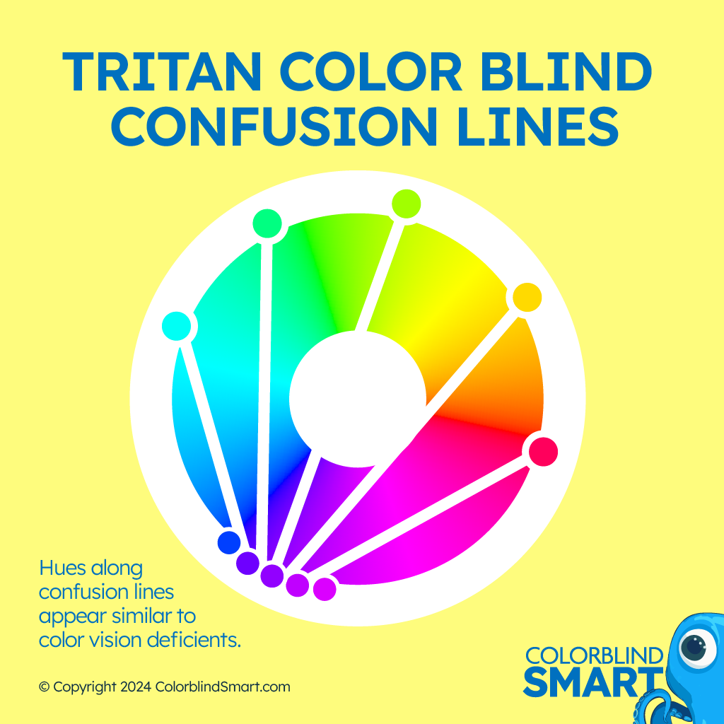
Another category of color blindness involves the blue cone cells, referred to as tritan deficiencies. This form is significantly rarer, affecting fewer than one in ten thousand people. Instead of confusing red and green, tritan deficiencies mix up blues and yellows.
- Tritanomaly means the blue cones function poorly, leading to partial confusion between blues and greens or yellows.
- Tritanopia involves the absence of functioning blue cones, causing more pronounced confusion between blues, yellows, and greens.
Though less common, blue-yellow color blindness can be equally frustrating. Picture trying to tell a bright blue sky from a greenish-blue ocean or distinguishing a soft yellow shirt from a pastel lavender one. These tasks become far more complicated, underscoring that color vision deficiency can affect any region of the color spectrum.
Achieving a “1-Dimensional” Color Wheel
One way to visualize color blindness is through the concept of collapsing or shrinking the color wheel. Each type of color deficiency collapses color space along distinct confusion lines. For deutan individuals like me, it’s like a diagonal slice of the color wheel merges into a single band, blending reds, greens, oranges, and purples. The same principle applies to protan or tritan lines—they compress different sectors of the color wheel, leaving those individuals with fewer distinct color categories.
While the “ten percent” statistic can be an oversimplification, it illustrates that people with certain color deficiencies experience fewer “unique” color categories. What others call “teal,” “cyan,” or “sage” might all look like one color to me—somewhere in the realm of “bluish.” The concept of a full, vibrant color wheel simply isn’t the same for many color blind individuals.
My Personal Journey and Training
I’ve taken what I know about color theory and turned it into a system for evaluating colors quickly and accurately. For example, when I see a bluish color it may be anywhere from purple to teal. Because my brain receives signals for both red and green, I can see this shade as either more teal or more purple. Recognizing its possible “location” on the color wheel helps me mentally map where that shade belongs.
Overcoming Color Blindness Limitations
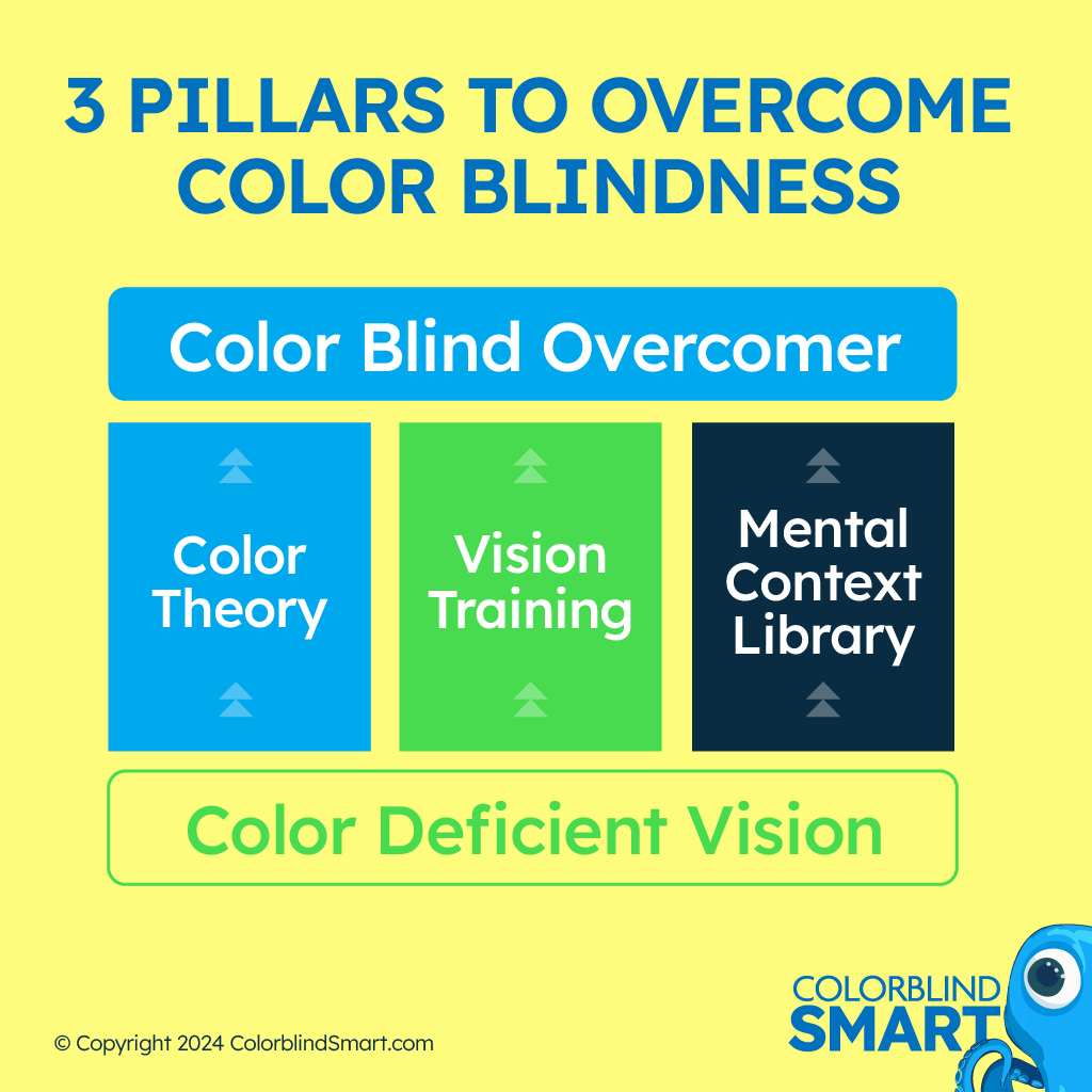
Overcoming color blindness might sound ambitious. Technically, I haven’t replaced my missing or malfunctioning cone cells, but I have built strong cognitive strategies to interpret the signals I do get. Here are the pillars I relied on:

- Understanding the Eye
Learning about rods and cones, along with how they normally function, gave me a baseline for what was happening in my retina. This made me realize my confusion wasn’t random—it had a cause I could identify and work around. - Color Theory
Diving into hue, saturation, and value taught me to see colors in relation to each other. If I mistakenly identify a color on the opposite side of the color wheel, I can cross-check that assumption based on known color relationships. - Building a Mental Library
Every time I encountered a color that confused me, I tried to label it once I figured it out—often by asking someone else or comparing it to a reference sample. Over years, this process helped me accumulate a mental toolbox of “red clues,” “orange indicators,” and so on. - Practice, Practice, Practice
Nothing beats real-world exposure. Whether working on design projects or selecting outfits, consistently testing myself and verifying each color built a new reflex. I hardly remember the last time I felt unsure about a color.
Embracing Color Blindness as a Superpower
I no longer feel embarrassed telling people I’m color blind, because I’ve discovered benefits in seeing the world a little differently. Learning these strategies has made me more observant of detail, texture, and lighting. For instance, if a friend asks, “Which sock is navy blue?” I might not see “navy” in the same way, but I pay close attention to the fabric’s shade, brightness, and context to figure it out. That level of focus can be an advantage in graphic design, where subtle contrast and clarity matter.
I genuinely believe color blindness can become a superpower if you combine knowledge of color theory with consistent training. If you’re color blind, you’re not doomed to misidentify hues forever. There’s a learning curve, but once you adapt, color confusion becomes more of a mild quirk than a debilitating obstacle.
Learn to Train Your Brain
If you’d like to improve your color perception skills, feel free to sign up for my free email course. In it, we cover:
- Pillars of Overcoming Color Blindness: A step-by-step method for re-training your visual system.
- How Your Eyes Work: A deeper look at rods, cones, and the genetics behind color vision deficiency.
- Color Theory Essentials: Hue, saturation, value, and why color relationships matter for color blind individuals.
- Building Your Mental Library: Techniques for memorizing shades and making consistent comparisons.
Sign up today! It’s completely free, and you can unsubscribe whenever you’d like. You might be surprised by how transformative systematic color training can be.
(Newsletter Signup)
Final Thoughts
Color blindness colors aren’t limited to just red and green. They cross into oranges, teals, pinks, yellows, and more. Recognizing the confusion lines that run through the color wheel is the first step toward managing color vision challenges. With the right knowledge and practice, you can transform the limitation into an adaptive skill. Embrace the process, learn how colors interact, and discover a new way to see the world—one that’s driven by understanding rather than frustration.
Last updated: April 04 2025